

Neutral Palette Guide — The Secret to Effortless Harmony 🤍🌾
Neutral tones never go out of style — they’re timeless, calming, and effortlessly elegant.
A well-balanced neutral palette brings visual harmony to your home, allowing texture, light, and space to breathe.
Here’s how to master the art of neutral living. 👇
1️⃣ Understand the Tones 🤍
Not all neutrals are the same.
-
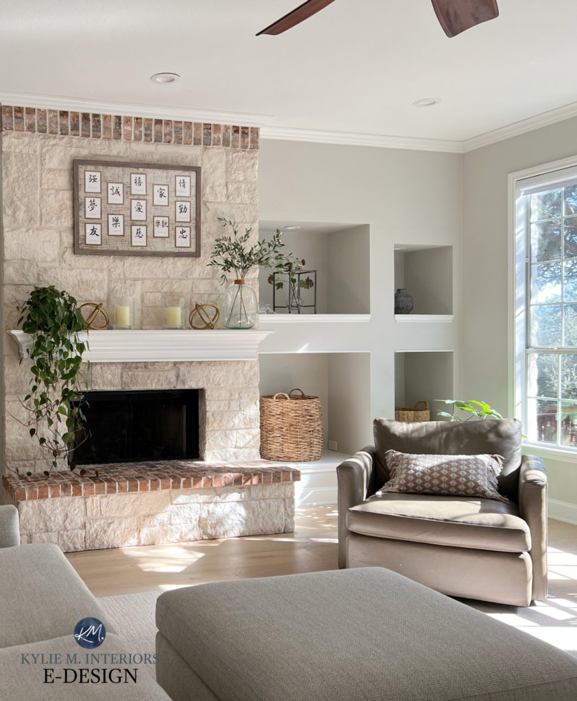
Warm neutrals: beige, taupe, cream — create comfort and coziness.
-
Cool neutrals: gray, stone, white — add clarity and minimalism.
💡 Mixing both creates depth and balance.

2️⃣ Layer Textures, Not Colors 🪶
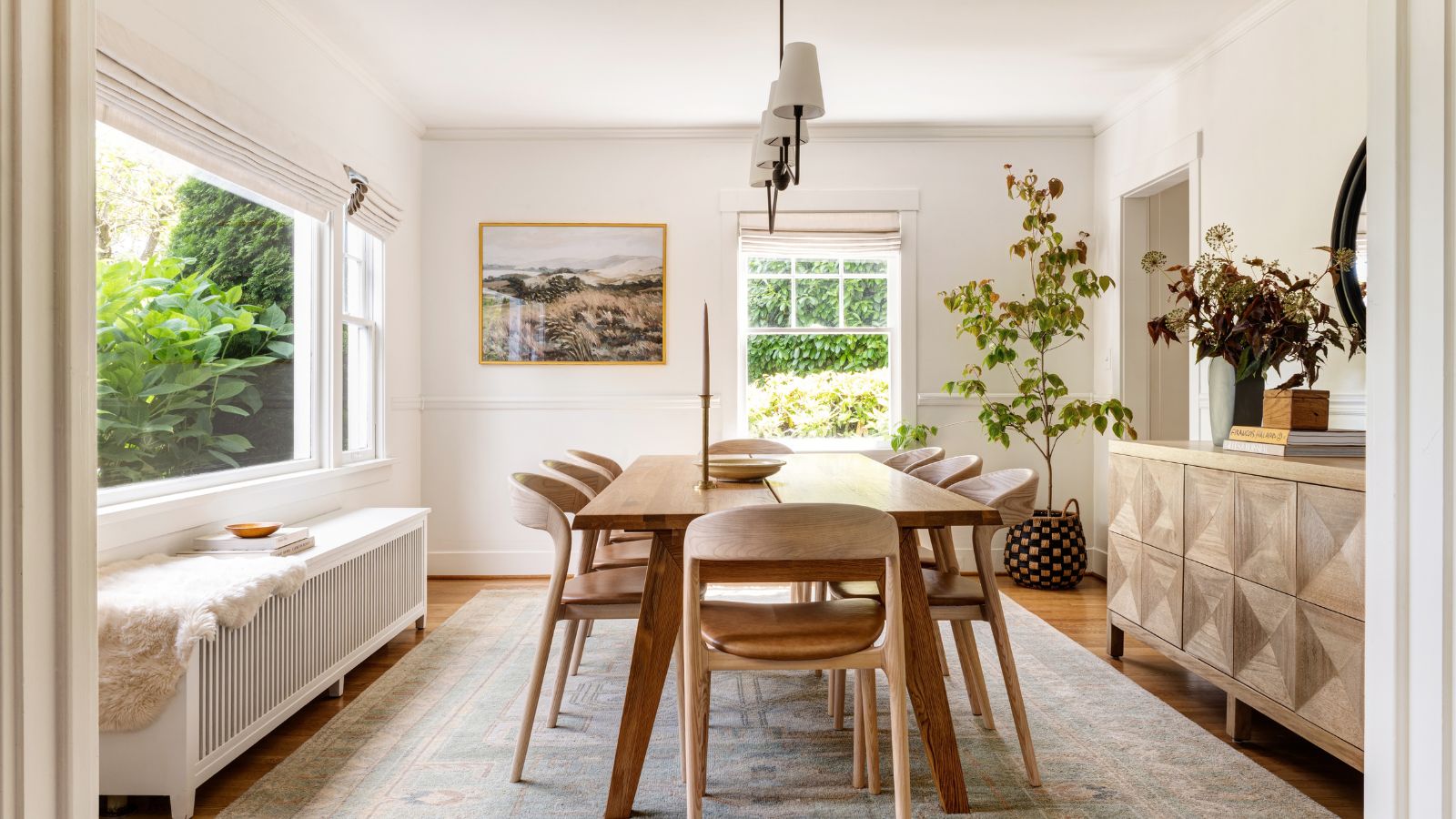
Neutral interiors come alive through texture.
Combine linen, wool, wood, and ceramic for contrast without chaos.
✨ Texture is the true color of minimalism.

3️⃣ Use Light as a Design Element 🌤️
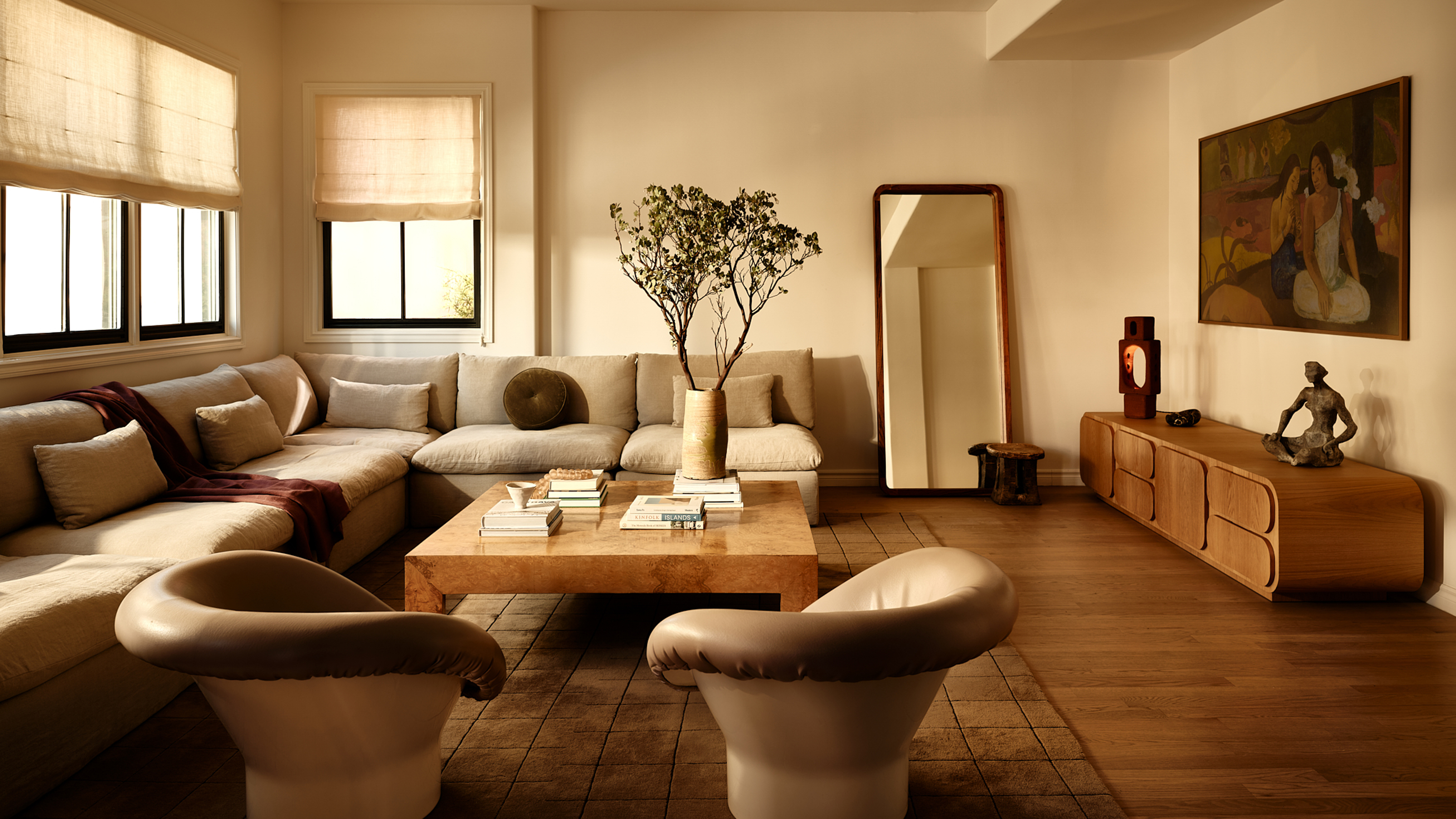
Neutrals reflect light beautifully — play with it.
Natural sunlight enhances warmth, while evening light brings soft shadows.
💡 A good neutral space changes gracefully throughout the day.

4️⃣ Add Subtle Contrast ☕
Avoid monotony by mixing tones slightly — sand with ivory, gray with cream, stone with white.
These small shifts add visual rhythm and keep the space alive.
✨ Harmony lives in gentle differences.


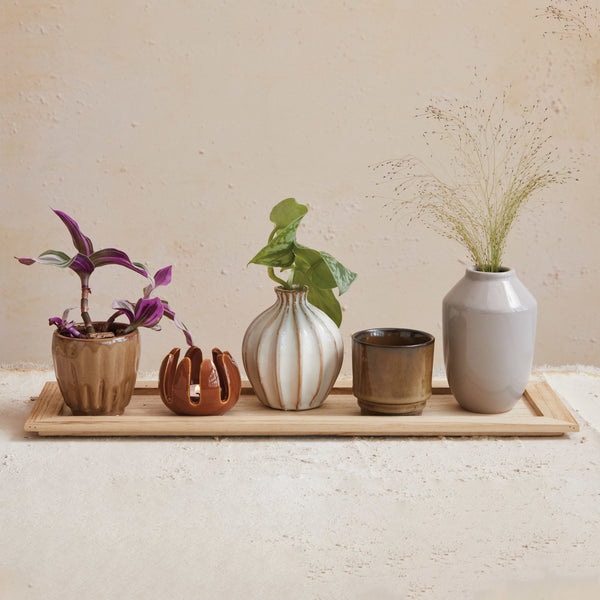
5️⃣ Choose Natural Accents 🌿
Bring warmth into neutrals with organic materials — wood trays, pampas, or pottery.
They add soul to simplicity.
💡 Nature is the color accent that never clashes.

✅ Neutral Palette Design Summary
| Element | Focus | Effect |
|---|---|---|
| Warm + Cool Balance | Tone harmony | Visual depth |
| Texture | Layered materials | Soft dimension |
| Light | Reflection | Calm brightness |
| Subtle Contrast | Gentle variation | Dynamic flow |
| Natural Accents | Organic feel | Timeless warmth |